These are my colour schemes i have designed for my music magazine. The schemes go along in rows, i am going to choose the second row down because all of the colours in that row reflect to my genre and my target audience. The red connotates sex and this will appeal to the male target audience because they will be attracted to the women on the front cover. The red can also be quite a girly colour so it will attract the female part of my target audience aswell. The black and white are both dull colours and this doesnt appeal to any type of genre/gender so this will appeal to all of my target audience, also the colours reflect eachother so they will stand out. The gold will be good for my magazine because it doesnt appeal to any certain target audience so will have a wide range of people it can appeal too. Also, gold reflects the genre of my magazine because Rap/RnB artists will usually wear bling which is always gold so this will remind the audience of that.
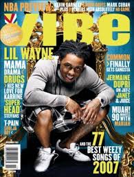
Vibe, which is an existing Rap/RnB magazine uses most of the colours that i am going to use, the colours go well with eachother because they stand out from eachother, attracting the audience because it will catch their eye easier.


No comments:
Post a Comment